Discharge Tools
FDC from random data
Workflow
The workflow in this example will generate some random data and applies two processing steps to illustrate the general idea. All tools are designed to fit seamlessly into automated processing environments like WPS servers or other workflow engines.
The workflow in this example:
- generates a ten year random discharge time series from a gamma distribution
- aggregates the data to daily maximum values
- creates a flow duration curve
- uses python to visualize the flow duration curve
Generate the data
# use the ggplot plotting style
In [1]: import matplotlib as mpl

In [2]: mpl.style.use('ggplot')

In [3]: from hydrobox import toolbox

# Step 1:
In [4]: series = toolbox.io.timeseries_from_distribution(
   ...:     distribution='gamma',
   ...:     distribution_args=[2, 0.5],  # [location, scale]
   ...:     start='200001010000',        # start date
   ...:     end='201001010000',          # end date
   ...:     freq='15min',                # temporal resolution
   ...:     size=None,                   # set to None, for inferring
   ...:     seed=42                      # set a random seed
   ...: )
   ...:

In [5]: print(series.head())
2000-01-01 00:00:00    1.196840
2000-01-01 00:15:00    0.747232
2000-01-01 00:30:00    0.691142
2000-01-01 00:45:00    0.691151
2000-01-01 01:00:00    2.324857
Freq: 15T, dtype: float64
Apply the aggregation
In [6]: import numpy as np

In [7]: series_daily = toolbox.aggregate(series, by='1D', func=np.max)

In [8]: print(series_daily.head())
2000-01-01    3.648999
2000-01-02    3.398266
2000-01-03    3.196676
2000-01-04    3.842573
2000-01-05    2.578654
Freq: D, dtype: float64
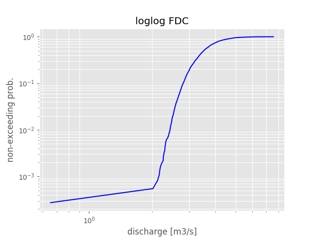
Calculate the flow duration curve (FDC)
# the FDC is calculated on the values only
In [9]: fdc = toolbox.flow_duration_curve(x=series_daily.values, # an FDC does not need a DatetimeIndex
...: plot=False # return values, not a plot
...: )
...:
In [10]: print(fdc[:5])
[0.0002736 0.0005472 0.00082079 0.00109439 0.00136799]
In [11]: print(fdc[-5:])
���������������������������������������������������������[0.99863201 0.99890561 0.99917921 0.9994528 0.9997264 ]
The first output line shows the first five exceeding probabilities, while the second line shows
the last five values. The output as numpy.ndarray is especially
useful when the output is directed into another analysis function or is used inside a workflow engine. This way the
plotting and styling can be adapted to the use-case.
However, in case you are using hydrobox in a pure Python environment, most tools can be directly
used for plotting. At the current stage matplotlib is the only plotting
possibility.
Plot the result
# If not encapsulated in a WPS server, the tool can also plot
In [12]: toolbox.flow_duration_curve(series_daily.values);
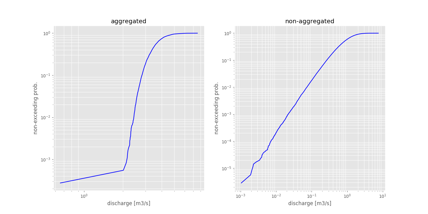
With most plotting functions, it is also possible to embed the plots into existing figures in order to fit seamlessly into reports etc.
In [13]: import matplotlib.pyplot as plt

# build the figure as needed
In [14]: fig, axes = plt.subplots(1,2, figsize=(14,7))

In [15]: toolbox.flow_duration_curve(series_daily.values, ax=axes[0]);

In [16]: toolbox.flow_duration_curve(series.values, ax=axes[1]);

In [17]: axes[0].set_title('aggregated');

In [18]: axes[1].set_title('non-aggregated');

In [19]: plt.show();
Reference
Hydrological Regime
Workflow
The workflow for the regime function is very similar to the one presented in the flow duration curve section.
In this example, we will use real world data. As the hydrobox is build on top of numpy and pandas, we can easily use the great input tools provided by pandas. This example will load a discharge time series from Hofkirchen in Germany, gauging the Danube river. The data is provided by Gewässerkundlicher Dienst Bayern under a CC BY 4.0 license. Therefore, this example will also illustrate how you can combine pandas and hydrobox to produce nice regime plots with just a few lines of code.
Note
In order to make use of the plotting, you need to run the tools in a Python environment. If you are using e.g. a WPS server calling the tools, be sure to capture the output.
Load the data using pandas
# some imports
In [20]: from hydrobox import toolbox

In [21]: import pandas as pd

# Step 1:
In [22]: df = pd.read_csv('./data/discharge_hofkirchen.csv',
   ....:     skiprows=10,            # meta data header, skip this
   ....:     sep=';',                # the cell separator
   ....:     decimal=',',             # german-style decimal sign
   ....:     index_col='Datum',      # the 'date' column
   ....:     parse_dates=[0]         # transform to DatetimeIndex
   ....: )
   ....:

# use only the 'Mittelwert' (mean) column
In [23]: series = df.Mittelwert

In [24]: print(series.head())
Datum
1900-11-01    328.0
1900-11-02    385.0
1900-11-03    422.0
1900-11-04    388.0
1900-11-05    381.0
Name: Mittelwert, dtype: float64
Note
The data was downloaded from: Datendownload GKD and is published under CC BY 4.0 license. If you are not using a german OS, note that the file encoding is ISO 8859-1 and you might have to remove the special german signs from the header before converting to UTF-8.
See also
- More information on the
read_csv function - is provided in the pandas documentation.
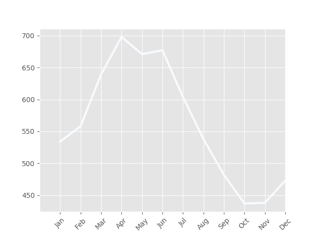
Output the regime
In order to calculate the regime, without a plot, we can set plot to None.
In [25]: regime = toolbox.regime(series, plot=False)

In [26]: print(regime)
[[534.]
 [558.]
 [639.]
 [698.]
 [671.]
 [677.]
 [604.]
 [538.]
 [482.]
 [437.]
 [438.]
 [473.]]
These plain numpy arrays can be used in any further custom workflow or plotting.
Plotting
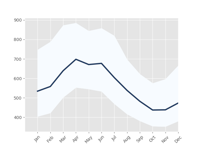
In [27]: toolbox.regime(series)
Out[27]: <matplotlib.axes._subplots.AxesSubplot at 0x7fa42157a160>
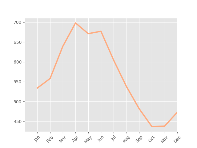
Note
As stated in the function reference, the default plotting will choose the first color of the specified color map for the main aggregate line. As this defaults to the ``Blue``s, the first color is white. Therefore, when no percentiles are used (which would make use of the colormap), it is a good idea to overwrite the color for the main line.
In [28]: toolbox.regime(series, color='#ffab7f')
Out[28]: <matplotlib.axes._subplots.AxesSubplot at 0x7fa424c0ec18>
Using percentiles
The plot shown above is nice, but the tool is way more powerful. Using the
percentiles keyword, we can either specify a number of percentiles or
pass custom percentile edges.
In [29]: toolbox.regime(series, percentiles=10);
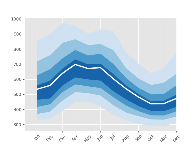
In [30]: toolbox.regime(series, percentiles=[25, 75, 100], color='#223a5e');
Adjusting the plot
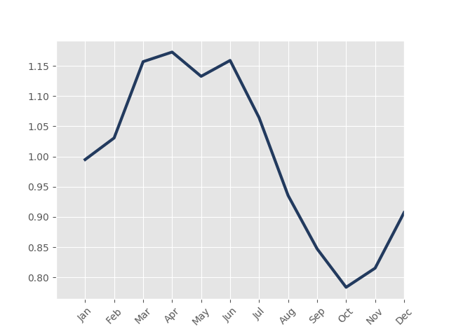
Furthermore, the regime function can normalize the monthly aggregates to the overall aggregate. The function used for aggregation can also be changed. The following example will output monthly mean values over median values and normalize them to the MQ (overall mean).
In [31]: toolbox.regime(series, agg='nanmean', normalize=True, color='#223a5e')
Out[31]: <matplotlib.axes._subplots.AxesSubplot at 0x7fa420e879e8>
Reference
See also